After the fall of the Dutch government on February 20, saturday morning at 4 o’clock, a new political pallet proposes itself: a coalition of CDA/Christian democrats, PVV/Party of Freedom (Geert Wilders) and VVD/People’s Party for Freedom and Democracy. Fusion of party colors has been used before as a metaphor for politics (paars/Purple for the Social democrat, Christian and Liberal coalition in the nineties’; see postscript for details).
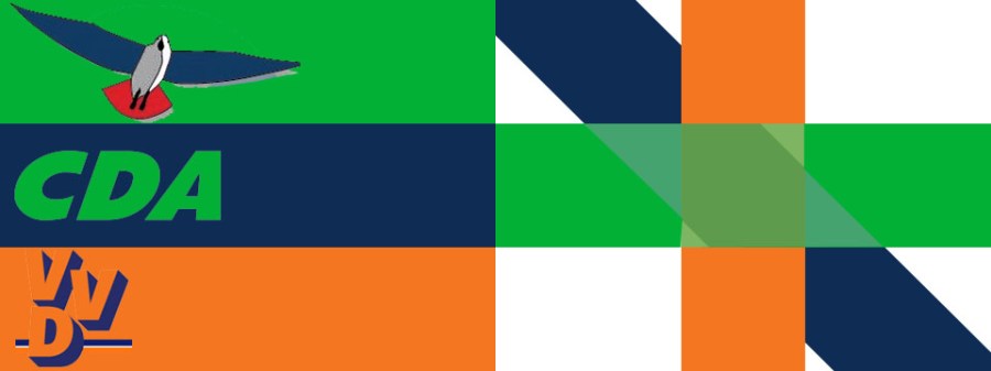
This is the new political flag we may see soon waving from the seat of govermentt (both in a literal and abstract version)… The seagull is the symbol used by the PVV party.

The seagull is known for its “harsh wailing or squawking calls” and is described as “a carnivore, which will take live food or scavenge opportunistically.” The PVV as a newcomer in party life has not yet chosen a typographical style or font. The seagull apart from its symbolism of a free moving bird, even in harsh weather, is represented by the reflective white of its breasts feathers, an royal house of Orange tail and dark blue silhouette wings as seen looking up at the sky. The blue can be seen as a reference to its liberal party origins (Geert Wilders split off as a person from the VVD/liberal party before founding his own party and the colour blue was used by the VVD in their early years)
The CDA has in the last decade represented their intentions simply with the colour green and though it is intended to be a positive ‘spring green’ the suppliers of the election paraphernalia – like scarfs and sweaters with party imprint – often deliver something what is more like a poisonous fluorescent green. The typography uses a bold capital lettering.
The VVD has a short while ago switched over to the popular orangist and national football team colour orange with a remnant of the old liberal colour blue. There is a small white line in their letter based logo, behind the ‘D’ of democracy (Volkspartij voor Vrijheid en Democratie/people’s party for freedom and democracy).
As none of the colours used by these potential new government coalition partners (I have taken the colours as used on their web sites) belongs to the pallet of primary colours, the net result of mixing colours gives a ‘drab’ and indistinct effect.
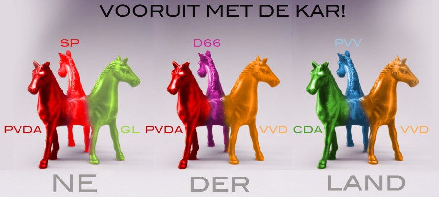
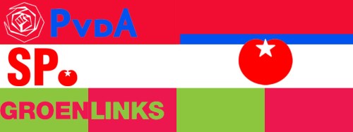
Another possible political pallet would be a red/green coalition, with PvdA (social democrats) and SP (socialist party, former maoists) for the red and D66 (new liberals) and Groen Links (Green Left) both using different grades of green, with Groen Links mostly adding some red in their differing logos, lately with a reversal of word meaning and colour. Whether the central emblem will be a red rose or a a red tomato will be a matter of negociation on the basis of electoral success or failure…

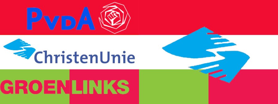
Below another possible coalition pallet and maybe three fields on the flag will be not sufficient to get hold of a governmental position. So what about the whimsical middle-right-and-left D66 party helping out? Alexander Pechtold the D66 party leader has made so many attacks on the PVV party of Wilders that he will have a hard time announcing that he considers flying on the back of the seagull. D66 will add just the colour green as a separate field or as a mix with the red… The social-democrat PvdA has several options in altering their two extra attributes aside the ‘socialist red’: they can move their ‘fisted rose’ symbol from its original position at the left to one at the right hand side and they can add a restricted field of capitalist liberal blue as a nice separator from the optional partners in the middle…

The coalition partner of the just fallen Balkende IV government, the Christenunie (Christian Union), may have enough forgiveness to reach out to the left and give their heaven blue helping hands (or is it angels wings?) to yet another possible political pallet and flag….

The minimal configuration of any Dutch governmental coalition flag is – still – a ‘tri-colore’ and it may take decades before something more advanced and more ‘representative’ of social complexities, like a rainbow flag, will be waving from the Binnenhof (Dutch government seat in The Hague). Such a flag may even have a design not with clearly separate stripes of colour as shown below, but as a real rainbow whereby both distinctive colours of the spectre can be seen and gradual shadings between them, where one is at loss if it is still red, or already orange, and so on… It would symbolize a more developed form of government as we have now: governance by consent based on a gradual process of coming to a consensus. Fixed dates, terms, dead-lines, and other limits set to enforce decision making, would be frowned upon, by the time that a rainbow pallet would be the best expression of the political coalition managing the country.

Postscript on Dutch political party colour symbolism
========

The ‘Purple Cabinets” (Paars Kabinetten) covered two periods: 1994-1998 and 1998-2002 and were made up of three parties: PvdA/Partij van de Arbeid (Labour Party), the VVD/Volkspratij Voor Vrijheid en Democratie (People’s Party for Freedom and Democracy/Liberal Party in the Dutch history sense; see my short explanation also on this blog) and D66/Democraten (19)66 (Democrats 1966), 1966 being the founding year of that party amidst political turmoil, especially in Amsterdam with its joyful Provo “revolution”. Paars/Purple added a new pallet to Dutch politics, 1994 it was the first time in eighty years that a government was formed in which none of the ‘confessional parties’ participated. The notion of confessional parties in the Netherlands means Christian Parties of which there were many in the Netherlands with one big Catholic party (KVP/Catholieke Volkspartij) and many distinct Protestant Christian parties. Three of these fused in 1980 into what is called since then CDA/Christen Democratisch Appèl: the Catholic KVP and the Protestant CHU/Christelijk Historische Unie (Christian Historical Union), and the ARP/Anti-Revolutionaire Partij (Anti-revolutionary Party). The Catholic KVP used in the fifties of last century still the yellow and white papal colours in vertical stripes, plus the light blue, also associated with the catholic church especially the virgin Maria. In the seventies the people’s party may have felt the competition of the socialist parties more strongly in their stronghold, the southern provinces of the Netherlands, which may explain the introduction of the colour red in some of their election posters (like the one with Klompé and De Jong). The Protestant ARP was the oldest political party in the Netherlands, founded in 1879, the letter ‘A; standing for ‘anti-revolutionair’, anti-revolutionary meaning the refusal of the ideas of the French Revolution. Their favoured colour in the ARP election posters has been ‘purple’ a colour which has several association: royalty in the political arena and in the biblical sense associated with the liturgical period of penitence and mourning. The expensive dye (Tyrian from Lebanon) needed to paint cloth purple, may have given it its air of exclusiveness, from Roman emperors to copy-cat dignitaries of the christian church. The protestant CHU/Christian Historical Union was a split off from the ARP and had a more liberal attitude to issues like participation of women in politics. The CHU has used a combination of purple and orange in its election posters, displaying their attachment to the royal house of Orange. The christian fusion party CDA has chosen from the beginning to use the colour ‘green’, mostly with lettering in white and in the early eighties still a band of ‘liberal dark blue’. Also D66 has used from their beginning in 1966 the colour ‘green’, thus the CDA has purposely tried to deflate the symbolism of colour coding in politics.

The liberal VVD can look back at half a century of continuity of its colour usage. Only in the fifties the colour red can be seen, but then as a threatening red back ground from the Cold War area against which a pure white American statue of Liberty is displayed with the colour blue as a symbol of liberalism. From the fifties onward the royal house orange is added to clarify that the party has no intention to change the Ntehrelands a a constitutional monarchy. The red only comes back in the display of the national Dutch flag as in the Mr Oud election poster.

The social-democrat PvdA/Labour party has of course ‘red’ as its main colour. The PvdA is a post war reconstitution of the earlier SDAP/Sociaaal Democratische Arbeiderspartij (social-democrat worker’s party). “Stemt Rood!” (Vote Red) says a postcard from a century ago, with a prototype worker in red clad. The factory chimneys and red flags have long disappeared from the social-democrat iconography, but red still sticks and the joint symbol of European social-democrat parties, the red rose in a fist, has been kept, be it often in a more artistic rendering than the stylised version of the seventies. PvdA party leader Wouter Bos and his cortege hand out red roses on their election descents in the streets; a symbolic gesture that a week or so ago has rumoured to have been been highjacked by the leader of the one of the new Dutch parties at the right hand of the spectre (also a spinoff of the liberal VVD party) Rita Verdonk…

Rita has been seen campaigning in an almost deserted inner town of Almere on a sunday morning. I somehow think to have seen it on television, but alas, could not find sufficient proof afterward. The colour issue is a strong element in Dutch elections as can be seen in this inglorious reportage of election campaigners on Saturday February 6 in the town of Spijkernisse (near Rotterdam) with the PvdA and their red pullovers, scarfs and roses, versus the orange scarfs of Rita Verdonk and her brand new TON/Tros Op nederland (Proud of the Netherlands) party. A hilarious photograph shows the TON and VVD teams meeting, both using the royal orange as an expression of their political position.

The post WWII right side of the political spectre Dutch parties have little or none consistency in their political colour pallet. I am purposely leaving out the very popular NSB/Nationaal Socialistische Beweging of Anton Mussert – active from the beginning of the thirties to the end of the WWII (who used the Dutch ‘tricolore’ and the colours yellow, red and black) – because the new right wing parties may be xenophobic to a certain extend, but none of them can be characterised as racist and/or anti-semite. To do so would be a ‘reductio ad Hitlerum‘ , a false comparison.
First post war newcomer on the national scene was the Boerenpartij/Farmers Party of the a man known as ‘Boer Koekoek’ (Farmer Cuckoo, the bird being his family name and in Dutch that bird has another connotation than in English, so not necessarily a fool). Their election poster and the poster of Binding rechts/Bound to the Right (a split off from the Boerenpartij) have green and orange as their colours. The Centrum Partij/Party of the Center mostly known as the vehicle of its lonely member in the Dutch parliament Janmaat, copied the colour palette of the liberal VVD party and implementing this in a Dutch national setting with a lion shown in a heraldic posture defending the rights of the “autochthon Dutch population.” The Centrum Partij/CP hardly filled the decade of the eighties with their “neither left nor right” activities and have been subjected to both leftwing activist physical attacks and anti-racist organisation court cases. In retrospect the xenophobic discourse of CP leader Janmaat is pale in comparison with some of islamophobic sermon offered by Geert Wilders (it would be too much of a derivation to go in further detail here, but an article of DeNieuweReporter weblog from last year tackels some of the issues at stake).
Interesting to see is that two of the latest upswing parties in the righthand spectre of Dutch politics have hardly any specific typography or colour pallet: the LPF/Lijst Pim Fortuyn (List Pim Fortuyn) and the PVV/Partij Voor de Vrijheid posters look similar in concept though. (for a detailed explanation of the complexities of the phenomenon of Pim Fortuyn you may read my article written just after his murder in 2002). We just see the leaders looking at us in a way that is both composed and joyful, suggesting the new future that lays ahead when we vote for them. Only recently Wilders and his PVV have embarked on some form of design with the seagull as a totem animal.
The last design to mention, the emblem of Rita Verdonk her TON/Trots op Nederland combines the Dutch tricolore with a royal orange stripe in the middle. Real Dutch royalits wil hoist on official festive days the national flag plus an orange free floating streamer on top. The design suggests also an American police badge that can be flashed in appropriate circumstances…. This is a less than subtle association because Rita Verdonk was a minister for Integration and Immigration and for a short while also minister of Justice in two of the Balkenende governments (2003-2006). She made her political carreer in the VVD party after a period in which she worked in prison management and the Dutch secret services. Verdonk was renowned for her harsh anti-immigration policies and her militant proposals to Dutch parliament to evict and extradite illegal asylum seekers. In the end Rita Verdonk isolated herself by her impulse and populist approach to politics which lead to her expulsion from the VVD party (it could be the influence of her more youthful alter-ego that make her fail as a states woman, from the years that she migrated as a youngster through successive radical movements from the Union of Law Trespassers (BWO) to the PSP (Pacifist Part) and the Nijmgen squatters movement, Verdonk according to some sources was known in those years as ‘Red Rita’). Will there be a reunion of the tripartite right-wing liberals in the Netherlands? VVD+PVV all in one TON (ton also means barrel in Dutch)? Maybe the Trots Op Nederland/TON emblem has this reunion embedded in its code: Red for Rita, Orange for Mark (Rutten/VVD), Blue for Geert (Wilders)/PVV. I now have the association of Rita Verdonk represented by a ‘red herring’ at the centre of her TON party emblem.
===
Visual sources either party web sites and for the posters the Documentatiecentrum Nederlandse Politieke Partijen of the Rijksuniversiteit Groningen plus the archives of the IISG Amsterdam.
Read Full Post »

